
Less than number one

Reported by IanTLS. We’re citing this one for the backwards U, the upside-down W masquerading as an M, and the 0 pretending to be an O. We don’t want to see what they’ve done to the Number Two sign.


|
This is a light-hearted humour site, with no offence intended.
|
Reported by IanTLS. We’re citing this one for the backwards U, the upside-down W masquerading as an M, and the 0 pretending to be an O. We don’t want to see what they’ve done to the Number Two sign.
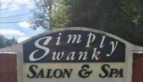
It is advisable to not share an initial cap with two separate words. Also we have concerns over the faux small caps in the bottom line. Use real ones—or not at all (or, do a better job simulating them, rather than just shrink down regular caps). (Posted by CrazyMyra on Mastodon, used with her permission.)
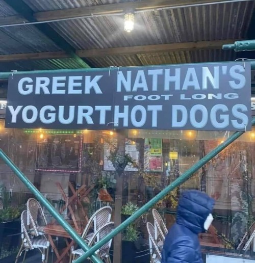
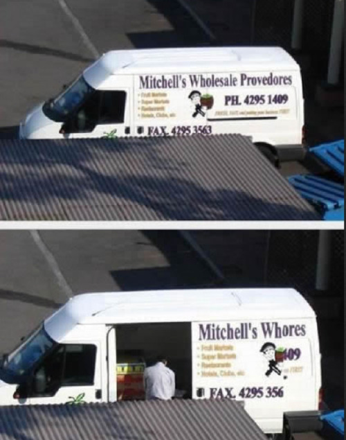
When putting signs side by side, remember to space them properly. Also, avoid stretching or condensing your type artificially, and use a proper apostrophe. Quite a few charges here from the Font Police. (Shared by Mark A. Rayner on Mastodon, where we found it, and reposted by him on Tumblr here.)
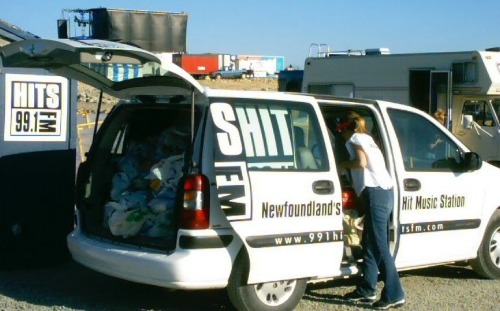
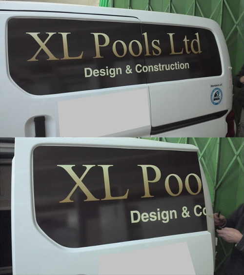
These are more misdemeanours than outright typographic crimes, with the exception of Mitchell’s Wholesale Provedores, with its faux condensing and ASCII apostrophe. But do think about how large signage can move.


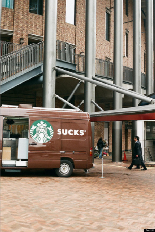
As far as Font Police is concerned, the bottom part is actually fine—Americana appears as it should. We’re far more concerned with how Avenir has been horribly, artificially condensed in the top part of this image. If only they used a proper condensed typeface—we would not have been called.

If a character has a descender, then let it descend. Don’t shrink it to match the height of another character that doesn’t have one. A particularly bad sign, photographed by Ian Simpson.

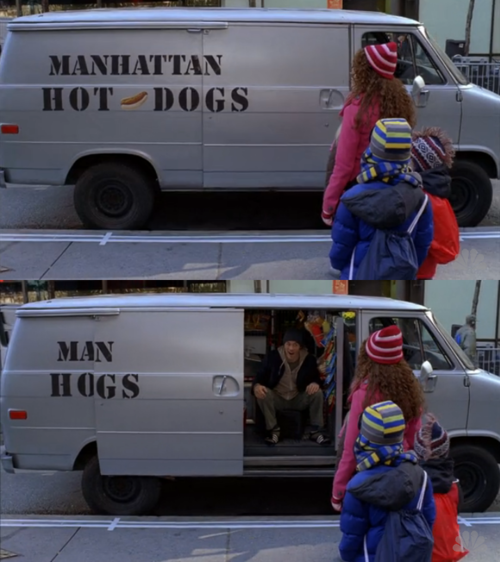
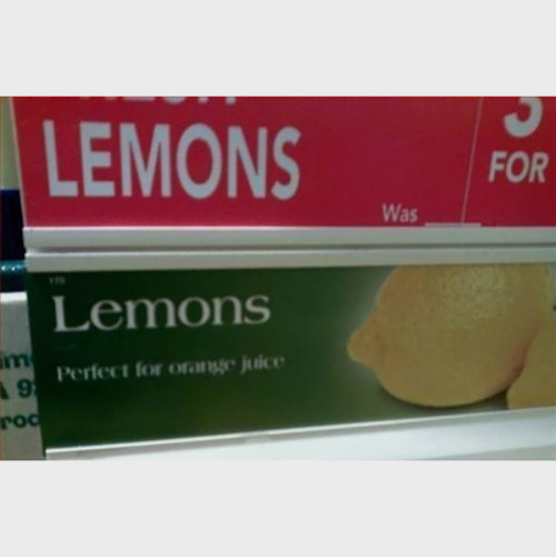
Nothing really wrong with the first sign other than the strange comma placements, but you might want to consider how something reads on the other side of the window. Photographed by Phil Read, used with permission.

Be careful using all caps, especially when you have chosen a geometric typeface with open counters. People might think the uppercase U is made from two components. From Katy Pearce on Mastodon, used with permission.
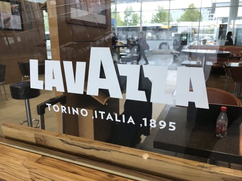
It’s good when people know there is such a thing is kerning, but bad when it’s terribly applied. The LA pairs are far apart, the AVA is obviously too tight. Thanks to Richard Foxworthy, photographed in Melbourne, Victoria.
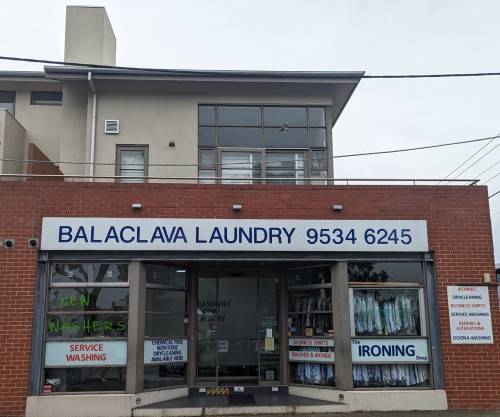
Things would look less threatening if the two lines of Helvetica weren’t artificially condensed. There’s enough room, after all. From Mona⁷ on Mastodon, used with permission.
1 / 36 Next